How to take bright photos in Lightroom. Basic photo processing in Lightroom. Correcting a Photo's Exposure
This post was written for people who are just starting to master photo processing on a PC. Obviously, it is simply impossible to cover such a broad topic in detail within one small material. Here I have tried to present only the most important information in the most concise form.
It is assumed that the reader has a certain minimum knowledge in the field digital photography and has some computer skills. Next, we will describe a universal algorithm that will allow you to quickly master the basics of processing in the RAW converter Adobe Photoshop Lightroom 6.9 (not to be confused with the Adobe Photoshop graphics editor!) We will use the English version of the program. It is assumed that the reader has already seen Lightroom and generally understands how the whole thing works, but when trying to improve a specific, individual photo, he fails, getting lost in the variety of sliders and buttons.
The algorithm described below is generally relevant for other converters; the basic functionality is approximately the same everywhere. Only the user interface, implementation of individual functions and other nuances will differ.
The photo source we will work with is a RAW file. JPEG processing is, of course, also possible, but it is less flexible and will not be considered within the scope of this post. How to quickly select the best frames from a variety of frames shot in RAW format, read.
An important digression: it only makes sense to process photographs on a more or less decent monitor. TN models, especially budget ones, are of little use for working with photos and when using them, the result is poorly predictable.
Processing ideology
There is an opinion that post-processing is a magic wand that can turn a bad shot into a good one. It's a delusion. Processing is needed in order to correct some flaws made during shooting and due to the imperfection of the photographer and his camera. Even during the shooting process, you should clearly understand which defects can be corrected later on the computer, and what needs to be done well right away. No editor can correct mistakes in focus, blurring due to too much long exposure, gross errors in the composition of the frame. Everything else you can try. Post-processing should be perceived primarily as a safety net for cases when it is difficult or even impossible to shoot well right away. And only secondarily, processing is an artistic tool.
So, we're done with the introduction, let's get down to business. We import the desired RAW file into Lightroom, mark it with the mouse and open the Develop tab, where all further action will take place. The correction tools are grouped in a column on the right side of the screen:
Before you move on to changing parameters, it's useful to learn a few little tricks. The interface elements discussed in the following paragraphs are marked with corresponding numbers in the screenshot.
- If you screwed up something completely wrong and want to return to the default settings, there is a “Reset” button in the lower right corner.
- If you want to reset the settings of only the current subsection, double-click on its title.
- If you need to reset only one parameter to its original state, double-click on its name.
- You can collapse or expand a section by clicking on its title.
- The effect of individual section settings on the image can be quickly turned on and off using the switch to the left of the section title.
- You can change the value of a parameter by “grasping” the mouse both on the slider itself and on the digital value of the parameter to the right of the slider. The second option is more accurate.
- Even more accurate is changing the parameter from the keyboard. Hover your mouse over the desired slider, then press the up or down arrow key to increase or decrease the value of the parameter, respectively.
We've sorted out the interface, let's start processing.
Basic parameters
- If the frame is noticeably darker or lighter than normal, correct this using the Exposure slider in the Basic section. At this stage, it is important to evaluate the frame as a whole, and not its individual light or dark areas, which we will work with a little later.
- If the frame as a whole looks clearly yellowish or bluish, adjust the white balance in the WB subsection of the Basic section. First, we try to change As Shot to one of the presets (Daylight, Cloudy, Shade, etc.). If this does not give an acceptable result, we proceed to manually adjusting the white balance using the Temp slider. We adjust this parameter so that the elements of the frame, which in reality are painted in a neutral color (white, gray), become so on the monitor screen, without skewing into a blue or yellow tint. You can also use a pipette (White Balance Selector) to point it at a point with neutral white or gray- for example, the white of the human eye. After this instruction, Lightroom will adjust the white balance in the frame automatically.
- If there are overly bright, overexposed areas in the photo that you would like to tone down, move the Highlights slider to minus. If necessary, make dark areas (shadows) lighter with the adjacent Shadows slider. It should be remembered that if the shadows are significantly brightened, noise may appear on them, spoiling the picture. Tools for dealing with noise will be discussed later.
- After adjusting the highlights and shadows, you may need to return to the Exposure parameter and adjust the exposure of the frame more accurately. Actually, Exposure, Highlights and Shadows are the three main sliders, using which we bring the photo to a balanced appearance in terms of lighting, when there should not be too dark or, conversely, very overexposed areas on it. If the processed RAW is obtained from a minimally decent camera, competent manipulation of the described three parameters will allow you to obtain a result comparable to what is obtained when shooting in HDR.
Cropping
Select the Crop Overlay tool on the top panel under the histogram; its button looks like a rectangle with a grid inside. Set the aspect ratio for cropping to Original (same as the original photo) or 2×3. It is not recommended to use cropping with an arbitrary aspect ratio (Custom) unless absolutely necessary. As you resize the frame, a grid is overlaid on top of the image to help you use the rule of thirds for frame composition. After trimming, we align the horizon or central vertical using the Angle slider. To complete cropping, click the Done button in the lower right corner of the screen.
Color correction
We return to the Basic section, in the Presence subsection we find Saturation and Vibrance. These parameters are responsible for the color saturation of the photo - the higher the saturation, the more “colorful” the picture is.
Saturation changes the saturation of the entire frame linearly; you need to change this parameter with caution so as not to “burn out” already saturated areas or make people yellow-skinned.
Vibrance works more intelligently, targeting only the mid-saturated areas and leaving the minimum and maximum saturation areas untouched. This allows you to color the frame more accurately with a minimum of side effects. This is why it is recommended to use Vibrance rather than Saturation in most cases. In situations where the photo is initially very uneven in saturation, you can use the “Saturation minus, Vibrance plus” trick. This will make the picture more uniform in color.
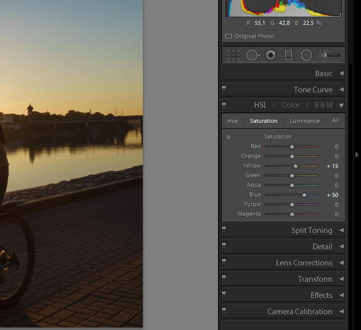
If you want to change the saturation of not all colors at once, but selectively (for example, to make the sky bluer or the foliage greener), select the HSL subsection in the HSL/Color/B&W section, and just below Saturation. We adjust the saturation of the desired colors with the corresponding sliders.
Don’t forget that color saturation is like salt in the hands of a chef. When used wisely, it makes food tastier, but when used stupidly it can completely ruin the dish. As you know, it is better to under-salt a dish than to over-salt it. The Internet is full of pictures with acidic colors that hurt the eyes, the whole thing looks sad. In everything you need to know when to stop.
Noise suppression
Open the Detail section, there we see the Noise Reduction subsection. We are interested in two sliders - Luminance (number 1 in the screenshot) and Color (number 2 in the screenshot). The first suppresses brightness noise, the second suppresses color noise. The most convenient way to adjust noise reduction is to enlarge the photo to a scale of 1:1 or larger.

Luminance noise appears as grain in plain-colored areas of a photo. The color of the grains does not differ from the tone of the area where these grains are present, only their brightness varies. The higher the ISO at which the shot is taken, the more pronounced the luminance noise is. By default, the Luminance parameter is set to zero, that is, luminance noise reduction is disabled. Since inside the camera, when shooting in JPEG, noise reduction works even at minimum ISO, the picture in Lightroom at default settings looks, although more detailed, but also grainier compared to in-camera JPEG. To get an in-camera image, the Luminance slider should be set to 15-20 for photos taken at minimum ISO. If the photo was taken at a higher ISO and this level of noise reduction is not enough, you can increase Luminance higher until the grain is reduced to an acceptable level. However, you need to be careful here, since noise reduction removes small details of the image along with noise. If you turn Luminance up too much, the picture will become unnatural, “plasticine”.
Color noise is similar to luminance noise, only its grains differ in color from the overall tone. These are multi-colored pixels that make the picture “dirty”. To combat color noise, use the Color slider. By default it is set to 25, which is enough in most cases. Raising the value higher makes sense when the photo was taken at a very high ISO and/or with a very poor camera. Also, stronger noise reduction may be necessary for deep color correction. For example, if you increase the saturation of the sky so that it turns from light blue to blue, characteristic noise artifacts may appear in some areas of the picture (number 3 in the screenshot). To eliminate them, gradually increase the Color value until the artifacts disappear.
Retouch
Sometimes it is necessary to remove certain small elements from a photograph - birds in the sky, debris, skin defects. To do this, use the Spot Removal tool, the button of which is located on the top panel and looks like a circle with an arrow.

We leave all the instrument settings at default and use the Heal mode. Enlarge the image to the right size and point the “sight” circle at the center of the object that needs to be eliminated. Use the mouse wheel to adjust the size of the circle so that it covers the entire object, click the left button. After this, the area under the “sight” (number 1 in the screenshot) will automatically be replaced by an adjacent fragment of the image, and a second circle will appear on the screen, marking the place where the fragment for replacement was taken from (number 2 in the screenshot). If the replacement with automatic fragment selection does not look good, the circle with the replacement fragment can be moved manually to obtain a better result.
If very small objects are retouched against a uniform background, the automation almost always works well and does not require adjustments. In this case, the Tool Overlay parameter in the lower left part of the screen (number 3 in the screenshot) can be switched to Never. In this mode, additional circles for selecting a fragment will not appear, eliminating defects will be very simple, in one click.
When all the necessary areas have been retouched, click the Done button in the lower right corner of the screen.
So, in fact, we looked at the main stages of processing. Often, after completing a cycle, it makes sense to return to its beginning and go through some steps again, but with finer adjustments.
Conclusion
As was said at the beginning of the post, the above algorithm is a basic, minimal option. It ignores sharpening, tone curves, filters and other tools. I decided not to mention even the Contrast and Clarity parameters, beloved by many photographers, so as not to confuse beginners once again. Processing, like other things, is best studied from simple to complex - first we master the basics to a state of automation, and only then move on. If you mindlessly grab at everything that the eye sees, a mess in your head is guaranteed.
There is a Service Triangle that you've probably seen before, and it looks something like this: there are three options (cheap, fast, high quality), but you can only choose two. I first saw this sign in a car workshop several years ago, but it applies to almost any professional activity in the production of goods or provision of services, and this applies especially to photography.
As a photographer, you don't have an unlimited amount of time, but you and your client expect to get good result, and this is not always cheap and fast. Luckily, Lightroom makes it possible to do basic processing on portraits in just a few minutes, which you can then apply to other photos, making your work even faster.
Before I get to the point in this article, I want to make it clear that the following steps are a process that works for me, but your unique solution may be different. It's important to find and create an optimal workflow that's easy to copy and repeat so you don't spend all your time doing the same editing steps over and over again.
Whatever editing program you're working with—whether it's Lightroom, Photoshop, Capture One, or even free tools like Photos or Picasa—it makes sense to develop a way of editing that suits your style. I know that the overall look I want to achieve for the portrait may be significantly different from what you prefer. Figuring out how to achieve my particular style took some time, but now my processing takes much less time because I have a set of steps to process my photos:
- White balance
- Sharpness
- Vignetting
These steps are quick, and typically account for 90% of the entire processing, and often result in a finished product without additional editing. Let's look at these steps one by one:

This original is quite good, but still needs some manipulation before I give it to the client.
Step 1: White Balance
One of the advantages of shooting in RAW format is the ability to calibrate the White Balance of your photo, while shooting in JPG does not leave much freedom not only regarding White Balance, but also most parameters of the photo. Of course, the downside to shooting in RAW is that adjusting White Balance can be time-consuming, but a lot of this can be eliminated by using Lightroom's Eyedropper tool (the target tool) instead of moving the sliders manually.

To quickly adjust White Balance, click on the Eyedropper button, then find an area in your image that retains a natural color - I think a slightly gray is better than pure white. This tool may not find the perfect colors everywhere, but you'll get close quickly, and then you can adjust the Temperature and Tint to your liking.
Another tip to speed up adjustments is to press directly on the Temperature and Tint numbers and use the up/down arrows to set the value you want, or hold and do the same to change the values more.
Step 2:Tone
Having finished adjusting the White Balance, we move on to other initial settings using the Main panel in the Corrections module. To achieve my particular style, I usually start with the following values. To quickly change each setting, highlight a value and enter a new one, then press to instantly move to the next one.

Exposure 0, Contrast 0. I don't change these values until I make the following settings, which you see below. They are global and affect the entire image, which is not at all what I want to do right now. If the image is still too light or dark after the rest of the basic adjustments, I'll increase or decrease the exposure accordingly, but I rarely need to adjust the contrast, and you'll see why in the next steps.
Sveta -25. This even works in bright areas of the portrait, so any overly bright spots will be softened.
Shadows +20. This is a way to lighten dark areas of a portrait and bring out a little more color and detail.
White +20, Black -25. I use these sliders instead of adjusting contrast because it gives me more granular control over general view and the feeling of my portrait. I'm essentially making the Whites and Blacks cleaner, which gives the portrait a rich look. Some people skip this step and make adjustments in the Tone Curve, but this is a matter of personal preference, although in my opinion it is much faster to adjust the Whites/Blacks.
Clarity -5. Most people turn up the Clarity, which essentially affects the edge contrast mostly in the midtones, but I like a more muted look, so I usually start by lowering the Clarity a few notches.
Juiciness 0 (zero). This slider mainly affects colors outside the normal range of the human eye, so it can be useful for outdoor photography if you want to make natural colors more vibrant. I leave this value at zero and then adjust as needed.
Saturation +5. I usually like to add a little color, so I start by increasing the value a little and then move up or down as needed.
I always I'm starting from these adjustments, and then adjust them individually. The entire process only takes a minute and almost always results in a result that looks significantly better than the imported image.

This photo is already brighter than the original, although the settings were the simplest.
Step 3: Sharpness
Once the color and tone adjustments are made, I almost always add some sharpening to the image. In portraits, it's important to keep the eyes in focus and sharp, so the next step after Basic Adjustments is to use the Detail panel to get the sharpness you need.

Click on the target symbol in the top left corner and then click on your subject's eyes to zoom in, then adjust the sharpness. I usually start at 50 and then use advanced options like Radius and Detail if needed, but this basic setting is quick and usually gives me the effect I want.
I also apply a sharpening mask to keep the changes from affecting the rest of the area. This way, the eyes remain sharp and the skin on the face does not acquire an undesirable texture. If you hold ALT while clicking on the Masking slider, you will see something like this (see below). The white areas will be sharpened, but the black areas will not. Use this to decide how large the mask will be applied in your portrait.

Step 4: Vignetting
This step is a bit controversial - some people love vignetting and others think it's completely out of place in modern photography, but as I said at the beginning, it's all about the style and workflow that works for you. I usually add a slight vignetting to my portraits, but if that's not your thing, then just skip this step. It's not part of the 5 Minute Workflow, but it fits nicely into mine, which is why I added it here. I use a light highlight and a dark vignetting, trying to keep the effect very subtle.

That's it - it's done
Following these four steps won't always lead you to a finished portrait, but as the title of this article implies, you can have a well-edited portrait in less than five minutes with these simple steps. Then you can apply additional tools, like brushes, blemish removal, or red-eye correction, but these steps will do most of the most important work.


After – slight changes, but you can see the difference
Save your settings as a preset
A final way to speed up the processing process even further is to create a preset that's based on your workflow, which you can then apply to the rest of your imported photos.

If you use this option, make allowances for the possibility of error and be more restrained in the edits to create a preset. You probably won't want to apply drastic changes to every photo, but if you find yourself going through the same steps over and over again, it might be time to create a preset.
You can apply it as desired after importing by right-clicking on any photo in the Adjustments module, or by selecting your preset in the Adjustments section (or by finding it in the Preset Options panel on the left side of Lightroom).
Adobe Lightroom - a graphic editor designed to facilitate and automate the process of photo processing.
If we compare Adobe Lightroom and Adobe Photoshop, the latter certainly wins in terms of the ability to apply various effects, processing, retouching and other modifications to photographs.
However, if the main task is to process more than 100 photos in the same style, tighten the white balance, remove glare, add the same effects, then Lightroom will cope with this task faster than Photoshop.
Lightroom ideology
This applies not only to Lightroom, but also to other converters and cataloguers, of which there are a great many.
Basic ideas for working in Lightroom:
– Sources remain untouched
– Photo focus
– Basic tools are always at hand
– Convenient cataloging
In this article, we have collected almost 4 dozen lessons that will help you not only master the basic capabilities of working in Lightroom, but also learn how to independently create presets for batch photo processing.
Lightroom from the Beginning - Lesson #1 Basic Settings
Lightroom from the Beginning - Lesson #2 (Tone Curve)
Lightroom from the Beginning – Lesson #3 HSL /Color /B&W
Lightroom tutorials (lightroom from the very beginning)
Complete Russian course on Lightroom
Do you travel a lot and your camera memory card becomes full too quickly? Do you want to select the best photos and delete unnecessary ones without spending many hours on it? The quality of the footage is not always one hundred percent satisfactory, but you don’t have the time or desire to learn how to use Photoshop?
Many photography gurus believe that the processing program Photoshop photos is not the only panacea, and there are several much more convenient and modern functionalities in the world. And if you answered yes to all the questions above, try testing Lightroom.
Let's take a step-by-step look at how you can quickly process your vacation photos in Lightroom.
Importing and selecting photos into Lightroom
Importing photos into Lightroom is convenient and simple - just insert a memory card into your computer. Moreover, each frame is opened in its own interface, and therefore working in Lightroom with big amount the footage becomes convenient and understandable. Further algorithm:

- Removal bad photos at the very first stage allows you to efficiently use disk space and time. On the bottom panel with checkboxes, you need to select the two left ones, and use the X key on the keyboard.

- You can easily rename the remaining photos in Lightroom in accordance with the selected template. Frame numbers should be entered in three-digit form so that the list of them is reflected correctly. To get the rename dialog box, use the F2 key.

- The selected and saved images can already be partially processed at this stage. For example, add clarity, enhance background shades, or use noise reduction. Having determined the optimal parameters for your camera yourself, just create a User Preset and, applying it to the first selected frame, select the entire set and press the Sync key.

Arranging the composition of a photo in Lightroom
Recommended by shooting experts, it is not always possible to catch it offhand during a photo hunt. Animals or children most often do not wait for the photographer to point the lens at them, and landscapes tend to fall to one side in the viewfinder, and unwanted citizens creep into the frame with strange gestures and facial expressions. The cropping function in Lightroom, called by the R button, helps to cut off all that is unnecessary.

On the cropping panel there is a button in the form of a lock, by closing it you will allow the system to maintain the original proportions of the frame, and by opening it you will be able to cut it arbitrarily at your own discretion:
- A “cluttered” horizon should be straightened in any case if it was not intended to create special dynamics in the frame.
- Extra cars and parts of people and animals that get into the viewfinder against the will of the author usually distract the viewer from the main idea of the photo, and therefore they will have to be cut off as best as possible and mercilessly.
- Using the golden ratio, photographers strive to have the main subject in the frame at one of the intersection points of two vertical and two horizontal lines that divide the image into nine fields. It is advisable to leave empty space in the direction of movement or gaze of the model in the photo.
Basic Lightroom parameters for photo processing
The main parameters that you can use in Lightroom for photo processing:

- Temp allows you to change the color temperature of the photo or the so-called “white balance”.
- Tint- changing the hue also affects the “white balance”.
- Exposure is a tool with which you can make the frame darker or lighter. Suitable only for initial correction if the photo is underexposed or overexposed.
- Contrast– a function to enhance or reduce the contrast of the frame.
- Highlights allows you to darken or, on the contrary, lighten at once all areas of the resulting image that look light.
- Shadows, on the contrary, brings darkened areas out of the shadows.
- Whites brightens the image to extreme values, followed by full illumination.
- Blacks is the limit value of shadows. The last two points require accuracy and a sense of proportion.
- Clarity is responsible for image clarity and makes it possible to give the frame a special volume and texture.
- Vibrance subtly saturates the photo with color, without overdoing it.
- Saturation a less intellectual function and, unlike the previous one, requires the artist to have a sense of proportion.
Unlimited possibilities

 And also the smart program Lightroom latest version allows you to correct or, on the contrary, create a vignetting effect, overcome distortion when shooting on wide angle lenses, apply a gradient filter to adjust the amount of light in certain areas of the image, remove dust spots on the matrix, clone areas of the image and highlight those parts of the frame to which you want to pay special attention to the viewer. The program also has special effects, and it makes it possible to independently create the necessary filters, save them and apply them, if desired, to subsequent frames.
Exporting photos from Lightroom and uploading to hosting is also convenient and automated. The program sets the required size for the images and adds the selected watermarks.

That's it - everything is simple and no Photoshop!